Blog
Product Updates
The latest updates and improvements to the Visible application.
All
Fundraising Metrics and data Product Updates Operations Hiring & Talent Reporting Customer Stories

founders
Product Updates
How and Why We Changed Our Onboarding
Intro
User Onboarding is one of the most challenging aspects of product design. Approaching the task of how can we improve our onboarding experience can end up involving an evaluation of the entire product offering and the messaging around it (including but not restricted to all marketing material, ads & search results in google, your website, and it of course runs right through your product.)
The latest part of our user onboarding experience we recently undertook evaluating was the first run in product experience. This was our third attempt at tackling it. From our research we’ve seen that we’re not alone in the struggle to get this right. A look across the blogs of many other products will show blog posts about onboarding experiences which have since been overhauled completely. It’s clear there is no one perfect onboarding technique and a successfully onboarded user is a difficult thing to measure. From out latest effort however, we’ve seen some exciting results and we’ve got some great feedback and questions so far so we decided to share a little insight into what led us to out current solution.
Just saw your new product update re: the contextual help guide. Great feature! Did you guys build this inhouse or use a tool to develop it?
Just read your blog post on your new help guide–I like the way you tackled that! Did you build that custom or use a product to provide contextual help?
The Problem
Our previous iterations focussed on a very particular and direct path towards what we considered to be an onboarded user within our own product. We established after which actions our users were most likely to become paying customers by looking at the statistics. We tried to then work out the shortest path to that point to create an onboarding experience that would get them to that ‘aha’ moment in one run. We tried two different approaches to this. Both with varying levels of success. It was clear that users were taking more actions within the product, but we weren’t seeing an increase in conversions to paying customers – or certainly nothing we could confidently attribute to our new onboarding experience. If anything, it was actually muddying the stats with regards to actions taken within the product because it was unclear how motivated these actions were, and whether users were seeing real value at the end of it.
We decided to take a step back and to scrap our previous concept of what we considered an onboarded user. We weren’t disregarding those main actions as a primary driver of adoption, but it was clear that the decision to convert didn’t come as easily as completing three steps and handing over the credit card details. The reasons that may cause one user to convert to a paying customer may not be the same for the next user. While their goals will be similar, there are different aspects of our product that can serve to help our users achieve them and the clinching moment for each user can be quite different.
We wanted to create a first run experience that better showcased our product and the things it can do, rather than getting our users to fulfil a specific number of actions. We also wanted to find a method that didn’t hinder the overall user experience by forcing the users down paths they may not want to go initially. We wanted to design a less intrusive onboarding experience, but one that still ensured our users didn’t get lost or give up before seeing the value of our product and came away having a very good sense of how Visible could help them achieve their goals.
Our users were converting once they’d had a chance to explore Visible, to see it’s wealth of features, it’s simplicity and ease of use and most often, for how quickly they could create data rich, beautiful updates. We were confident we could remove our previous onboarding walkthrough and we could leave users in our product with no help and almost all will figure out the main actions within our product. However, what they might not see in a first run experience is the wealth of other rich features in our product that are deliberately a little less obvious initially. The nature of our product means we have a lot of features, some complex, some simple. We wanted a way to showcase these features and offer direction for future actions, but not insist right off the bat.
The Solution
What we came up with was the Visible Help Guide. The idea was that it would be contextual and show the right information at the right time. It would be unobtrusive and only offer help when help was asked for and get out of the way when it was not needed. It would be adaptive and help each user progress in the direction they wanted to take and not through a set of predefined steps that we had decided for them.
In order for it to be contextual we ensured it was wired up to the relevant sections of our product so that when it was opened, it would first show help content relevant to that specific area of the product. If it was requested at first (we ask them how they’d like to explore Visible at the beginning), it would pop out when a user first visited an area of the product with relevant help and suggestions for that section. It would then also offer a quick overview of everything they could do from within that section and as a result gave an insight into the wealth of features available in Visible without overwhelming or insisting they complete them in a first run.
The result is a clever resource that will grow with our product and acts as a reference for everything that can be done within Visible. It offers guidance to new users to get started and prompts for next actions without insisting, and it also acts as a useful reference for more experienced users to ensure they’re getting the most out of Visible and to uncover some features that they may not have been using previously.
The response has been extremely positive. We’ve seen a 30% increase in Product Qualified leads coming through since we implemented our new guide! (Learn more about PQL’s here). We’re seeing more actions being taken within the product than our previous onboarding experiences and our users are taking these actions themselves. It’s also helped to reduce the number of requests coming into our customer support team for queries on how to perform specific actions as our users can now get help from within the app and also have an easier way to find our knowledge base in Intercom. We’re sure there will be future iterations on what we currently have but the results so far have been very positive and we finally have something to build on.

founders
Product Updates
Our New Contextual Help Guide
Every six months I usually say something along these lines to our awesome product team…
“I just went through our on-boarding flow, I think we could be doing a better job. How do we let customers help themselves but also not leave them with a completely blank slate? Can’t we make signing up more frictionless? What if they never know XYZ exists?”
Improving Our SaaS Onboarding
Our team goes to work, we make some great improvements and then six months later I go through our sign up flow again. Rinse & Repeat. This time around, our team spent days researching what the best companies are doing. We read their blog posts and looked at how they tackled the problem. Then a funny patterned emerged. Whenever we tried out their latest sign up and on-boarding flow, in almost every instance, it was totally different to their most recent blog post about how they improved it! We realized we weren’t alone.
When we started to ideate on our new on-boarding flow we created a list of things that we didn’t want. In particular:
We didn’t want an on-boarding experience that a user just clicked rapidly through to get to start using the app.
We didn’t want to have to draw cute arrows for the user to find out where things were.
We didn’t want to have a bunch of fake & dummy data populate their instance only for them to have to delete it.
Our goal was simple: Provide help when the customer needs it and get out of the way. Today we’re excited to launch our new Help Guide available to current customers and new triallers.
To enable our new on-boarding and help guide just click “Help Guide” in the bottom left of your navigation on Visible. From the right our guide will slide out and give you tips, tricks, GIFs and videos.
The best part? It is contextual. Depending on where you are in the app we will will show you relevant videos, GIF and links to our knowledge base to make sure you are getting the most from Visible. For example, if you are in Updates and open the help guide we will show you a quick 2-3 minutes video, give you an overview of the section and a list of related features you can take advantage of with GIFs and links to our knowledge base.
I’m hoping that if you are reading this blog post in six months and sign up for Visible, our on-boarding and Help Guide are still here for you! If you have any questions, comments or suggestions email hi@visible.vc.
Up & to the right,
-Mike

founders
Product Updates
Intelligent Google Sheets & Our Google Cloud Partnership
Today we are beyond thrilled to be releasing improvements to our Google Sheets Integration and to announce that we are now a Google Cloud Partner. Our application is now available to the Google Cloud and G Suite ecosystem.
What are the improvements?
Many of our customers using our Google Sheets integration restructure, manipulate or change their Sheets files over time. Previously it was tedious making sure these changes were reflected into your Google Sheets Dashboards and Updates.
Our release today allows for intelligent mapping. As your Sheets change we will understand if rows are moved up, down or removed and automatically reflect those in your Visible account. No action is needed on your part.
If you make larger changes to your data set like renaming metrics we may prompt you with a question to make sure we are correctly updating metrics. We will give you the option to fix that in Visible without having to connect & reconnect your connection. E.g. lets say you rename New ARR to New Annual Recurring Revenue. We’ll prompt you with a message similar to the following to let you train the integration further:
All you have to do is hit “Yes” and be on your way:
What’s next?
Google Sheets is our most popular integration, expect to see some more improvements in the coming weeks. We want to make it as easy to get your KPIs and Metrics into Visible.
We’re also working on a great resource to make awesome Google Sheet Templates available to our community. If you want a sneak peek check out our Google Sheet Template Library!
Up & to the right,
-Mike & The Visible Team

founders
Product Updates
Zapier + Visible
We’re thrilled to be launching our Zapier integration out of beta and to bring the power of over 700+ applications to our customer base.
Even better is you can utilize Zapier’s multi-step workflows and add on the Visible trigger to your existing apps.
Not familiar with Zapier? Zapier connects all of the apps you use to automate your workflows. When something happens in a particular application an action is triggered in another. Check out some examples below to understand how you can automate your stakeholder reporting with Zapier and Visible.
Send Sales and Marketing data directly to Visible Metrics.
Send KPIs from Pipedrive, Intercom, Mailchimp or any supported CRM and marketing tool directly to Visible metrics.
Connect to your database!
Want to automatically update Daily Active Users, Transactions Processed or other important KPIs from your own database? Simply setup a query in Zapier and pass along to Visible.
Automate all the things.
Zaps can be simple, complex and tailored to your every need. You can always fine more in our knowledge base and feel free to reach out anytime to support at visible dot vc. We are standing by and ready to help take your stakeholder reporting to the next level.

founders
Product Updates
Product Update: Filtering & Bulk Editing
We recently pushed some great improvements to the Data section on Visible to make it easy to search, filter and edit your respective metrics. We also make some speed improvements so the data section should load faster as well!
Filtering & Sorting
You can now sort and filter by categories & data sources. Simply click the filter icon and select your respective fields to filter the data table.
Bulk Editing
Select multiple metrics and quickly edit many metrics at once. You can quickly assign a new category and metric type with the new bulk editor as well as delete metrics you no longer need.
Be on the look out for even more improvements in the future. We hope you enjoy!

founders
Product Updates
Xero Tracking Categories
Introducing Xero Tracking Categories
We recently launched additional improvements to our Xero integration that all of our customers can start taking advantage of today.
In addition to getting financial metrics and chart of accounts metrics from Xero, you can now filter any of your metrics your respective Xero tracking categories.
It’s as simple as selecting a metric and then clicking the drop down to apply the tracking category. You can add as many of the same metrics as you’d like. E.g. if you wanted Revenue across all of your sales regions you can bring those in!
Protip: Transform your Xero Tracking Categories with our formula builder.
You can read more about the Xero tracking categories in this knowledge base article. Questions? Send us an email.
Up & to the right,
-The Visible Team

founders
Metrics and data
Product Updates
Video: Formula Builder (Customer Acquisition Cost)
How to Calculate Customer Acquisition Cost in Visible
Check out the video above to get a glimpse of our formula builder. In this example we calculate customer acquisition cost by combining data from Salesforce and Google Sheets!

founders
Product Updates
Consolidated Xero Reporting
Automatically Consolidate Multiple Xero Accounts
If you run a business that operates in different countries, different currencies or one that requires many Xero or Quickbooks accounts, you will know the pain of consolidated reporting.
Being able to quickly get an understanding of Revenue, Cash Position, Expenses and more can be a pain. Luckily, with Visible and our formula builder, you can now quickly and intuitively combine many accounts for your consolidated Xero reporting.
Customers can connect as many Xero or Quickbooks accounts as needed. From there, it’s as simple as creating a new metric from a formula and building your new consolidated metric.
If you want to convert the currency of a particular metric, you can apply the logic of Exchange Rate * Metric.
You can read more about our formula builder and data transformation in our most recent announcement. If you are an accounting or finance professional, we’d love to talk to you! Feel free to contact us at spectrum at visible dot vc and make sure to check out our partner program.

founders
Product Updates
A + B = C -> Introducing Formulas on Visible
We’re excited to give you a sneak peek & preview our new Formula builder. With our intuitive Formula builder you’ll be able to create functions by using any of your current metrics, from any data source, integration or providing a metrics directly.
This will be a game changer as you’ll be able to dynamically create new metrics and transform your existing data streams directly on Visible.
The Visible Formula Builder
In the example above, we take calculate Customer Acquisition cost by taking Sales & Marketing Expenses from Xero and dividing by New Customers coming from Salesforce. Just one of infinite possibilities!
As new data comes into Visible your formulas will update on the fly and the new data points will be readily available at your fingertips.
If you wish to get on the beta shoot us a note at beta@visible.vc. You can read more about the integration in our knowledge base and we put together this quick explainer video as well.
Up & to the right,
-The Visible Team
founders
Product Updates
April Product Improvements – Data Labels, Annotations, Goals & more
Hey there – We wanted to provide a quick recap of all of the major functionality that we’ve launched in April. As always feel free to send us any feedback, questions or comments.
Data Labels on Charts
You can now add the actual value on the data point on your charts. This will display the actual values of the respective metric on the chart itself.
We suggest using charts with 8 or less data points to utilize data labels or you’ll quickly overcrowd the visualization.
Chart Annotations
While you are creating or updating a chart you can now call out specific data points and add your own context through annotations. Simply click on any data point and add in text.
Goals
With any chart you can now add a goal, benchmark line or threshold targets. Simply navigate to the Options tab to customize your different goals and benchmarks.
File Attachments in Updates
Visible Updates now support file attachments. They’ll be available as one-click downloads and we’ll automatically detect the file type and add a nice icon for you! They are great for more granular financial statements, presentations or supplemental data sets.
Table support in our text editor
Our Updates text editor now supports tables. They are great for structuring any of your qualitative information in Updates.
Other minor yet useful improvements:
Better support for copying and pasting text from other text editors into Visible Updates!
A very beautiful looking success message once you publish an Update in Visible.
-The Visible Team

founders
Product Updates
Announcing Our ChartMogul Partnership & Integration
Visible + ChartMogul
We’re excited to announce our partnership today with ChartMogul. ChartMogul provides analytics for building a better subscription business to over 800 customers (and growing!). By integrating with Stripe, Braintree, Recurly and more, ChartMogul provides turnkey metrics to give you instant insight into your customers.
Visible customers will be able to integrate their ChartMogul metrics directly into Visible and use for their own stakeholder reporting.
Our initial integration includes your recurring revenue metrics, customer metrics, churn data and LTVs. We’ll continue to improve the integration so send any feedback our way. You can find more info on the ChartMogul + Visible feature page.
If you have any questions or comments about Visible + ChartMogul send them to hi@visible.vc. Current Visible users can read more about the integration in this knowledge base article.
Up & to the right,
-Mike & The Visible Team

founders
Product Updates
Winter Wrap Up
With spring around the corner we wanted to provide the latest in the Visible world. Below we’ll highlight some key functionality that has been released over the past couple of months.
Data Source Integrations
We made some great improvements to our existing integrations, added new data sources and currently support 10 direct data sources in Visible.
New integrations include Mixpanel, Advanced Google Analytics and ChartMogul.
Update Improvements
Updates can now be sent through a shareable and trackable link in addition to email. We also added support to save Updates as PDFs and improve the editor experience.
View Example Update
As always, please feel free to directly respond with any questions, comments or to setup a time to chat!
Up & to the right,
The Visible Team

founders
Product Updates
Xero Integration 2.0 – Chart of Accounts
Introducing Xero Chart of Accounts
We originally launched our Xero integration into the Add-On marketplace just over a year ago and it has quickly become one of our most popular accounting integrations. Xero is a cloud accounting platform that has gained in popularity and is beloved by their power-user accountants.
Our initial integration was great. We pulled in your high level financial metrics from your Income Statement, Balance Sheet and Cash Flow Statement. We started to hear more and more that our customers wanted to get granular reporting on their Chart of Accounts — after all, being able to compare your Online Ad Spend to Budget has become increasingly popular as “unit economics“ has become the in vogue term of 2016.
We’re excited to release our Xero 2.0 integration to all that not only pulls in financial metrics but will query and pull in any account from your own chart of accounts.
By pulling in your unique chart of accounts you’ll get to fine tune how you present and tell the story of your most important data.
Protip: Use your actuals from your Xero chart of accounts and compare them against a budget or forecast by utilizing our Google Sheet integration.
We’re excited to be improving the initial set of integrations we used when we launched Visible. Should you have any requests for future integrations or current ones, send us a note to hi at visible dot vc.
Up & to the right,
Mike & The Visible Team

founders
Product Updates
Zapier & Product Updates
We quietly launched some awesome updates to Visible last week that we wanted to make sure got the attention they deserve. The two updates below focus on automation of your KPIs and enhancing the storytelling of your data.
Zapier Integration
Our integration with Zapier is now live! It is in beta so you’ll have to use this link to accept the invite to Zapier.
Link any trigger apps and assign values to your Metrics in Visible. E.g. Every time a new trial of our “Pro” account is started in Stripe I have that add +1 to our Pro Trials Created metric within Visible.
You can find more info in our knowledge base. Feel free to reach out with any questions or recipes that you love!
Update Enhancements
You can now do two commonly requested actions within an Update. 1) Include bold number visualize types and 2) Include 2 charts side by side in an Update similar to a dashboard.
In an Update simply hover over a chart component and click the grid icon to add a secondary chart. You can click the arrow to re-arrange the position as well.
We hope you enjoy these updates! Stay tuned for more exciting announcements in the near future!
Up & to the right,
-The Visible Team
founders
Product Updates
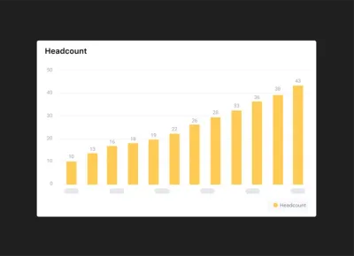
Q3 Product Updates
With Q3 in the books, we put together a wrap up of all the improvements that have been introduced on Visible over the past 3 months.
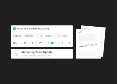
Recurring Updates
We launched recurring updates so companies can focus on telling their story to their stakeholders without having to worry about the cadence or creation of the Update.
Recurring Updates help build a rapport with the most influential people in your business. They are great for frequent team updates, investor updates and for fundraising. Read more about them on our blog: https://visible.vc/blog/recurring-updates/
Business Intelligence Layer
With our new BI layer, we are automatically calculating 5 additional metrics for each metric provided.
Easily show growth changes, rolling averages and more. We also improved charting so you can add as many axes as you wish! Read more about the BI layer on our knowledge base.
Shareable Dashboards
With Shareable Dashboards you can have tight control over who can see what. You may want certain data available to your board which could be different than your team or potential investors.
Shareable dashboards are part of a much larger push towards what we are calling Visible 3.0 which you can read more about on our blog: https://visible.vc/blog/visible-3-0-note-ceo/
Other Improvements
In addition to some major features above we also launched the following:
Ability to search Updates & pagination to increase speed.
New color palette options to give your data a unique twist.
Charting frequency improvements to customize when charts start/end.
Exporting Metrics, great for pivot table analysis.
Coming Soon…
We have some exciting integrations lined up with Zapier, appFigures and Mixpanel. Should you wish to get on any of the beta programs and provide feedback email us at beta@visible.vc
Unlock Your Investor Relationships. Try Visible for Free for 14 Days.
Start Your Free Trial