Blog
Product Updates
The latest updates and improvements to the Visible application.
All
Fundraising Metrics and data Product Updates Operations Hiring & Talent Reporting Customer Stories

founders
Product Updates
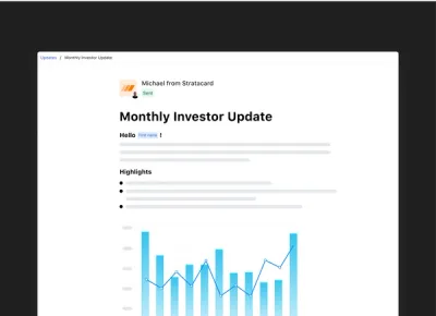
New Feature: Recurring Updates
The Power of Consistent Investor Communication
One of the things that makes investor updates powerful is consistency. The best startups use updates to create a story, drawing lines (not dots) that demonstrate their progress in a dependable way. Through consistent investor communication, a company can signal that they will be good stewards of their investors’ capital. These are the companies investors fund and trust.
We’re thrilled to announce the next evolution of Updates on the Visible platform — Recurring Updates.
Recurring Updates will help coach our customers through habit-forming nudges aimed to make them more accountable and dependable with their stakeholder reporting.
With Recurring Updates, customers will be able to turn an Update into a Recurring Update. Recurring Updates have the following unique features:
Ability to set a customized sending schedule with helpful email reminders
Any charts & data visualizations will sync to the recent reporting period
A send history that shows the previous updates that have been a part of the Recurring Updates series
Recurring Updates will live, anchored, in the sidebar navigation. Once a Recurring Update has been sent, we’ll show you the most recent stats for it. Ready to start your next Update in the series? Simple, just click “Start next update”.
Visible customers can learn more about Recurring Updates in this help article. Recurring Updates are live for all customers starting today!
Up & to the right,
Mike & The Visible Team

founders
Product Updates
Reactions, Update Template Library, and More
This month we’ve brought you product improvements that are all about making your Updates better. Check out what’s new from the last month below.
Reactions to Updates
We all like to know that the work we put into updates is appreciated. Reactions make it easy to know when your stakeholders have engaged with your update. With reactions, recipients can simply give your Update a thumbs-up.
Reactions are currently in beta, if you’re interested in having Reactions enabled for your account, send us an email to hi@visible.vc.
Update Template Library
Not sure what to include in your next Update? We’ve got your back with our new Update Template Library.
We are in early stages of building out our Update Template Library. Add any template to your account with the click of a button. Check out the library here. Have a template you’d like to share? Shoot us a message to marketing@visible.vc
Check out the Library >>>
Tables in Updates
The same tables you use in Dashboards can now be used in Updates! What seems like a simple feature from the outside was actually a complex user experience to nail.
Feel free to contact us with any feedback or questions you have!
Up & to the Right,
-Matt & The Visible Team
founders
Product Updates
Updated Navigation + Tables in Updates
If you sign into Visible today, you’ll see an updated navigation. The changes we’ve made are small, but they will accomplish a couple key items:
Make drafting, editing and sending Updates easier than ever
Set the stage for some game-changing improvements & features to be delivered later this quarter.
What, exactly, is changing?
Update drafts are now in the sidebar. Instead of a couple clicks to get into an Update, you’ll be able get there with much more ease.
We’ve fixed Settings, Metrics and Contacts to the bottom of the sidebar. We’ve also created a specific Sent Updates navigation item to quickly see the Stats of your previously sent Updates.
Our aim was to have anything you are frequently creating, viewing or editing to be prominent, near the top of of the navigation, while features that you interact with less frequently to be positioned at the bottom.
Tables—better late than never?
The same tables you use in Dashboards can now be used in Updates! What seems like a simple feature from the outside was actually a complex user experience to nail.
The team rallied and launched this feature, which many of you have requested. Thanks to Eugene (who is new on our product team) for tackling this!
Feel free to contact us with any feedback or questions you have!
Up & to the Right,
-Mike & The Visible Team
founders
Metrics and data
Product Updates
Salesforce Updates – Contacts & Accounts
Contact and Account Objects in Salesforce
The Visible product team just updated our Salesforce Integration. We now support the Contacts and Accounts objects in addition to the already existing Leads and Opportunities objects.
If you need a refresher on Salesforce, you can read more in our knowledge base. Contact us to send us any feedback or questions.
Up & to the right,
-Mike & The Visible Team.

founders
Product Updates
Personalized Updates, New Text Editor & Improved Readability
Our Improved Investor Update Editor
We’re thrilled to announce two new design & UX improvements to the core Visible experience. Starting today, Updates can be addressed to respective recipients. These are commonly referred to as “merge tags”, and you can use them to personalize an Update with a recipient’s first name, last name and email.
Simply highlight the text you want to personalize and click the “tag” icon and choose the field you want to include. We will populate the fields based on the names set in your Contact Lists & Users section. If a field happens to be blank, you can include a fallback value.
Merge tags are being powered by an all new text editor and writing experience! In addition to giving us a great platform for new features, the overall experience should be much more pleasant. This new text editor is turned on by default for all new users; current customers can email beta@visible.vc and we will enable this for you prior to the full migration.
We have also changed the typeface used across the application. Instead of seeing the Whitney font which we’ve been using in our application for over 2 years, you’ll now see your default system font. (On Mac and iPhone, you’ll see the San Francisco typeface, on Windows Vista it will be Segoe UI, and on Android you’ll now see Roboto). This font will likely be familiar to you already as it’s currently used natively by your respective OS and more and more frequently on many major web applications. This change will create a faster and more cohesive experience not only within the Visible application, but also in Update emails that are published via Visible.
Please send any and all feedback our way!
Up & to the right,
– Ciarán & The Visible Team

founders
Product Updates
Xero Reports: Consolidating Your Data
Managing multiple Xero entities can be a time-consuming and tricky task. Using a combination of our Xero Add-on and new Variance Reporting you can easily centralize, consolidate, and distribute your key Xero financials.
Centralize Your Xero Data
If you’re managing multiple entities or subsidiaries in Xero you can quickly connect multiple entities directly to Visible to get started centralizing your key financials. Once you’ve got your Xero accounts connected you can begin to create new custom metrics, charts, and financial reports using Updates.
Xero Consolidation & Transformation
Looking for revenue across all subsidiaries? Easy! Using Formulas, transform your data from multiple entities to automatically generate consolidated metrics and KPIs. Once your formula is in place you’re consolidated metrics will refresh on a nightly basis and fuel your charts, dashboards, and Updates.
With our Xero integration we’ll automatically bring in all of your historical data so you are able to compare your current periods data to previous months, quarters, years, etc. Add in forecasts and budgets as well to gain deep insight into where your financials are comparing across the board. Easily break down your consolidated metrics to dig deeper into individual data points to give added context around particular movements and trends.
Once your formulas and variance reports are in place you’re new insights will automatically be generated as new data comes in from Xero. From here, you can transform these into easily shareable Dashboards and Updates that can be shared on a regular basis with your management teams, investors, and board members.
You can check out an example of an Update generated using Xero Consolidation and Variance Reporting here.
Interested in learning more? Feel free to check out a video walking through our new Variance Reporting below as well.
founders
Metrics and data
Product Updates
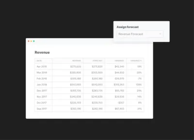
Using Variance Reporting in Visible
Use Variance Reports to Determine How You’re Tracking to Your Projections
How are we doing? Are things going to plan? Are we overspending? Underspending? Where should we double-down? Cutback?
These are all questions that you’ve likely encountered in a management meeting or recent board meeting.
Today we are excited to announce new Variance Report module that will be part of our insights layer. Variance reporting will let our customers quickly assign any of their KPIs to a forecasted or budgeted value and with one-click get back a full Variance Report.
We’ll calculate the following in your Variance Report:
MTD Variance
MTD Variance %
YTD Actual
YTD Variance
YTD Variance %
YTD Actual
prior yr YTD Actual
prior yr YTD Variance
prior yr YTD Variance %
Our budget vs actual and variance reporting will give you instant insights and reporting capabilities for any of your metrics in Visible. Being able to make timely decisions based on your forecasts and budget will help accelerate growth, manage your bottom line and hit goals across your organization. Utilizing the variance report in Visible is great for:
Weekly team updates showing progess towards your Monthly and Annual Goals
Crafting monthly management reports to your leadership teams providing feedback on where you under/over performed
Creating pre-board meeting reports that give a health check on where you are compared to board approved budgets.
We hope you enjoy! Sign in to Visible to get started to or sign up! Feel free to email support@visible.vc with any questions, comments and feedback.
Up & to the right, The Visible Team

founders
Product Updates
Your New & Improved Data Section
The Visible team recently pushed changes to the data section to provide more insights, context and usability.
We’ve broken down the data section into a couple of key components.
Experience Improvements
With just a single click you can automatically generate a chart for any metric. You’ll have the option to return to the data section to create additional metrics or you can go to the respective dashboard and continue to edit the chart.
Insights
With just a few clicks, you’ll be able to see the following metrics that we automatically calculate for you:
Growth % – the change from the previous year
Previous Year – the value for the same metric one year prior
Previous Year Change – The % change for the same metric from the previous year
Total – The cumulative total for all the values of a given metric
3 Period Rolling Avg. – The rolling average for the previous 3 periods.
6 Period Rolling Avg. – The rolling average for the previous 6 periods.
12 Period Rolling Avg – The rolling average for the previous 12 periods.
Frequencies
We will automatically roll data up to different frequencies. E.g. if you are bringing in daily data, you’ll be able to view it as:
Daily
Weekly
Quarterly
Annually
Metric Settings
This is where you can set the type of metric, the default color for your charting needs, description and any other pertinent settings for the metric.
We’ll be updating data connections and the chart builder in the near future to provide an ever more seamless workflow. As always ping hi@visible.vc should you have any questions or feedback.
Up & to the right,
-Ciarán & The Visible Team
founders
Product Updates
Year over Year Metric Comparison
Great metrics share the same traits. Two of the most important traits are making sure your metrics are comparative & a ratio/rate.
The Visible team just pushed a great update to make it even easier to compare your key metrics to a previous year along side the % change from the previous year. Want to jump right in? Check out our Year-over-Year Knowledge base article.
A year may seem like a lifetime in a high-paced environment but it’s important benchmark yourself to where you were the prior year. It’s especially useful to take a breath and give your leadership team a chance to make informed, strategic decisions.
We love inspiration (aka copying great work) on the Visible team so wanted to share some great ideas you are welcome to use for yourself.
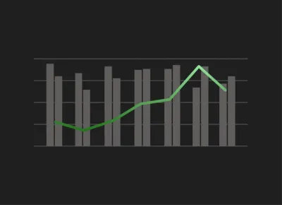
Revenue vs Prior Year
This is a great way to quickly see where your KPI is currently, where you were the previous year and what is the delta from the previous year. Charting the % Change on the opposing axis lets you quickly see the good (or bad).
In the example above you can see 2018 is off to a great start with major gains from the previous year.
Revenue & Forecast
The first example is a good but what were the expectations for a particular KPI? Did we over-perform? Under-perform? Just squeak by?
This example lets you quickly understand the business is over-performing (yes!) and what we expect for the next quarter.
Want to know more about what makes a good metric? Check out this post by Plan Brothers and this one by OnStartups.
Want some help getting these setup in your Visible Account? Just email our data team at hi@visible.vc.
Up & to the right,
-Mike & The Visible Team
founders
Product Updates
Slack Your Updates
Send Investor and Team Updates in Slack
Today we are launching our Slack integration into beta! You’ll be able to publish Visible Updates to any of your Slack channels in addition to other current publishing methods (email, PDF, shareable link).
We’ll show a preview of the Update text and the first chart or image in your Slack channel with a link to view the rest!
Instantly collaborate with your team member and other stakeholders in your Slack channel around any of your Updates.
Looking for some inspiration?
Send your True North Metric to your company wide channel to show progress towards goal with commentary.
Show your #sales channel how you are pacing for the current period.
Visualize your ARR movements to keep the entire company on the same page.
Stay tuned as this is just the beginning for our Slack integration!
Up & to the right,
Mike & The Visible Team
founders
Product Updates
Visible Now Integrates With 1,000 Other Products
We know that getting your work done requires many different web tools. In fact, the average business uses between 10 and 16 apps. You have your email app, CRM, note-taking tool, cloud storage tool, team communication app, along with project management tools and various to-do lists. Sometimes, it can be a struggle to get them all working in tandem. Now that Visible has 1,000 integrations, you can choose your favorite tools and easily integrate them with Visible.
Visible now connects to 1,000 other web tools, thanks to our Zapier integration. With workflow automation tool Zapier, you can set up your own codeless integrations called “Zaps”. Zaps will automatically send information from one tool to another, so you’ll spend less time manually transferring data between your business tools and can dedicate more focus to creative, big picture tasks.
Boost Your Productivity with Popular Visible Integrations
No matter what other apps you use, chances are Visible integrates with them via Zapier. Here are some of the most popular integrations that Visible users already use to be more productive.
The New Year is the perfect time to evaluate your processes and find ways to boost productivity. Check out some of the Visible Zap’s here.

founders
Product Updates
How and Why We Changed Our Onboarding
Intro
User Onboarding is one of the most challenging aspects of product design. Approaching the task of how can we improve our onboarding experience can end up involving an evaluation of the entire product offering and the messaging around it (including but not restricted to all marketing material, ads & search results in google, your website, and it of course runs right through your product.)
The latest part of our user onboarding experience we recently undertook evaluating was the first run in product experience. This was our third attempt at tackling it. From our research we’ve seen that we’re not alone in the struggle to get this right. A look across the blogs of many other products will show blog posts about onboarding experiences which have since been overhauled completely. It’s clear there is no one perfect onboarding technique and a successfully onboarded user is a difficult thing to measure. From out latest effort however, we’ve seen some exciting results and we’ve got some great feedback and questions so far so we decided to share a little insight into what led us to out current solution.
Just saw your new product update re: the contextual help guide. Great feature! Did you guys build this inhouse or use a tool to develop it?
Just read your blog post on your new help guide–I like the way you tackled that! Did you build that custom or use a product to provide contextual help?
The Problem
Our previous iterations focussed on a very particular and direct path towards what we considered to be an onboarded user within our own product. We established after which actions our users were most likely to become paying customers by looking at the statistics. We tried to then work out the shortest path to that point to create an onboarding experience that would get them to that ‘aha’ moment in one run. We tried two different approaches to this. Both with varying levels of success. It was clear that users were taking more actions within the product, but we weren’t seeing an increase in conversions to paying customers – or certainly nothing we could confidently attribute to our new onboarding experience. If anything, it was actually muddying the stats with regards to actions taken within the product because it was unclear how motivated these actions were, and whether users were seeing real value at the end of it.
We decided to take a step back and to scrap our previous concept of what we considered an onboarded user. We weren’t disregarding those main actions as a primary driver of adoption, but it was clear that the decision to convert didn’t come as easily as completing three steps and handing over the credit card details. The reasons that may cause one user to convert to a paying customer may not be the same for the next user. While their goals will be similar, there are different aspects of our product that can serve to help our users achieve them and the clinching moment for each user can be quite different.
We wanted to create a first run experience that better showcased our product and the things it can do, rather than getting our users to fulfil a specific number of actions. We also wanted to find a method that didn’t hinder the overall user experience by forcing the users down paths they may not want to go initially. We wanted to design a less intrusive onboarding experience, but one that still ensured our users didn’t get lost or give up before seeing the value of our product and came away having a very good sense of how Visible could help them achieve their goals.
Our users were converting once they’d had a chance to explore Visible, to see it’s wealth of features, it’s simplicity and ease of use and most often, for how quickly they could create data rich, beautiful updates. We were confident we could remove our previous onboarding walkthrough and we could leave users in our product with no help and almost all will figure out the main actions within our product. However, what they might not see in a first run experience is the wealth of other rich features in our product that are deliberately a little less obvious initially. The nature of our product means we have a lot of features, some complex, some simple. We wanted a way to showcase these features and offer direction for future actions, but not insist right off the bat.
The Solution
What we came up with was the Visible Help Guide. The idea was that it would be contextual and show the right information at the right time. It would be unobtrusive and only offer help when help was asked for and get out of the way when it was not needed. It would be adaptive and help each user progress in the direction they wanted to take and not through a set of predefined steps that we had decided for them.
In order for it to be contextual we ensured it was wired up to the relevant sections of our product so that when it was opened, it would first show help content relevant to that specific area of the product. If it was requested at first (we ask them how they’d like to explore Visible at the beginning), it would pop out when a user first visited an area of the product with relevant help and suggestions for that section. It would then also offer a quick overview of everything they could do from within that section and as a result gave an insight into the wealth of features available in Visible without overwhelming or insisting they complete them in a first run.
The result is a clever resource that will grow with our product and acts as a reference for everything that can be done within Visible. It offers guidance to new users to get started and prompts for next actions without insisting, and it also acts as a useful reference for more experienced users to ensure they’re getting the most out of Visible and to uncover some features that they may not have been using previously.
The response has been extremely positive. We’ve seen a 30% increase in Product Qualified leads coming through since we implemented our new guide! (Learn more about PQL’s here). We’re seeing more actions being taken within the product than our previous onboarding experiences and our users are taking these actions themselves. It’s also helped to reduce the number of requests coming into our customer support team for queries on how to perform specific actions as our users can now get help from within the app and also have an easier way to find our knowledge base in Intercom. We’re sure there will be future iterations on what we currently have but the results so far have been very positive and we finally have something to build on.

founders
Product Updates
Our New Contextual Help Guide
Every six months I usually say something along these lines to our awesome product team…
“I just went through our on-boarding flow, I think we could be doing a better job. How do we let customers help themselves but also not leave them with a completely blank slate? Can’t we make signing up more frictionless? What if they never know XYZ exists?”
Improving Our SaaS Onboarding
Our team goes to work, we make some great improvements and then six months later I go through our sign up flow again. Rinse & Repeat. This time around, our team spent days researching what the best companies are doing. We read their blog posts and looked at how they tackled the problem. Then a funny patterned emerged. Whenever we tried out their latest sign up and on-boarding flow, in almost every instance, it was totally different to their most recent blog post about how they improved it! We realized we weren’t alone.
When we started to ideate on our new on-boarding flow we created a list of things that we didn’t want. In particular:
We didn’t want an on-boarding experience that a user just clicked rapidly through to get to start using the app.
We didn’t want to have to draw cute arrows for the user to find out where things were.
We didn’t want to have a bunch of fake & dummy data populate their instance only for them to have to delete it.
Our goal was simple: Provide help when the customer needs it and get out of the way. Today we’re excited to launch our new Help Guide available to current customers and new triallers.
To enable our new on-boarding and help guide just click “Help Guide” in the bottom left of your navigation on Visible. From the right our guide will slide out and give you tips, tricks, GIFs and videos.
The best part? It is contextual. Depending on where you are in the app we will will show you relevant videos, GIF and links to our knowledge base to make sure you are getting the most from Visible. For example, if you are in Updates and open the help guide we will show you a quick 2-3 minutes video, give you an overview of the section and a list of related features you can take advantage of with GIFs and links to our knowledge base.
I’m hoping that if you are reading this blog post in six months and sign up for Visible, our on-boarding and Help Guide are still here for you! If you have any questions, comments or suggestions email hi@visible.vc.
Up & to the right,
-Mike

founders
Product Updates
Intelligent Google Sheets & Our Google Cloud Partnership
Today we are beyond thrilled to be releasing improvements to our Google Sheets Integration and to announce that we are now a Google Cloud Partner. Our application is now available to the Google Cloud and G Suite ecosystem.
What are the improvements?
Many of our customers using our Google Sheets integration restructure, manipulate or change their Sheets files over time. Previously it was tedious making sure these changes were reflected into your Google Sheets Dashboards and Updates.
Our release today allows for intelligent mapping. As your Sheets change we will understand if rows are moved up, down or removed and automatically reflect those in your Visible account. No action is needed on your part.
If you make larger changes to your data set like renaming metrics we may prompt you with a question to make sure we are correctly updating metrics. We will give you the option to fix that in Visible without having to connect & reconnect your connection. E.g. lets say you rename New ARR to New Annual Recurring Revenue. We’ll prompt you with a message similar to the following to let you train the integration further:
All you have to do is hit “Yes” and be on your way:
What’s next?
Google Sheets is our most popular integration, expect to see some more improvements in the coming weeks. We want to make it as easy to get your KPIs and Metrics into Visible.
We’re also working on a great resource to make awesome Google Sheet Templates available to our community. If you want a sneak peek check out our Google Sheet Template Library!
Up & to the right,
-Mike & The Visible Team

founders
Product Updates
Zapier + Visible
We’re thrilled to be launching our Zapier integration out of beta and to bring the power of over 700+ applications to our customer base.
Even better is you can utilize Zapier’s multi-step workflows and add on the Visible trigger to your existing apps.
Not familiar with Zapier? Zapier connects all of the apps you use to automate your workflows. When something happens in a particular application an action is triggered in another. Check out some examples below to understand how you can automate your stakeholder reporting with Zapier and Visible.
Send Sales and Marketing data directly to Visible Metrics.
Send KPIs from Pipedrive, Intercom, Mailchimp or any supported CRM and marketing tool directly to Visible metrics.
Connect to your database!
Want to automatically update Daily Active Users, Transactions Processed or other important KPIs from your own database? Simply setup a query in Zapier and pass along to Visible.
Automate all the things.
Zaps can be simple, complex and tailored to your every need. You can always fine more in our knowledge base and feel free to reach out anytime to support at visible dot vc. We are standing by and ready to help take your stakeholder reporting to the next level.
Unlock Your Investor Relationships. Try Visible for Free for 14 Days.
Start your free trial